National Geographic Redesign Concept
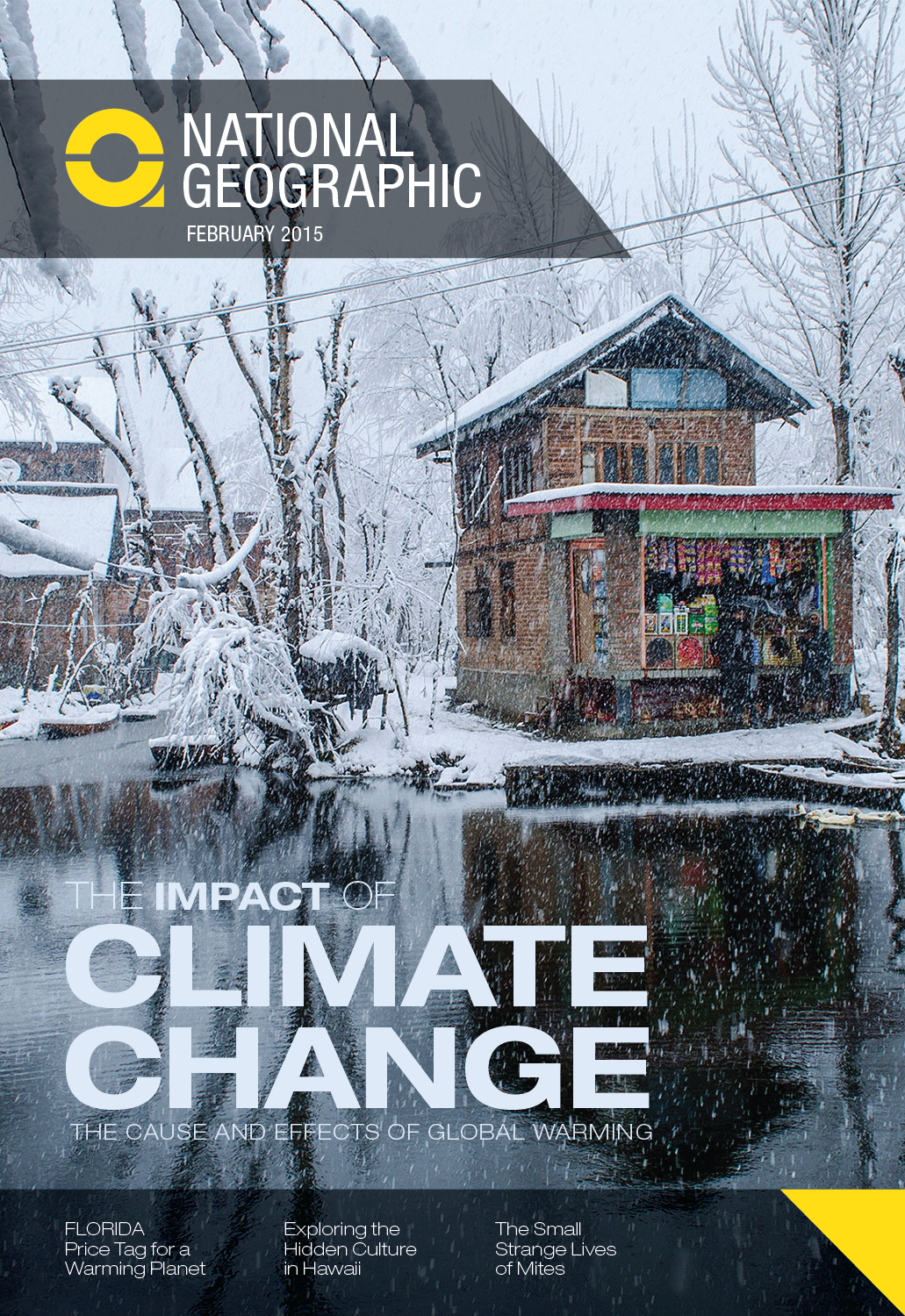
For this student publication project, the assignment was to rebrand a magazine of our choosing.
I chose National Geographic because I wanted to work on the idea of travel and photography while maintaining the importance of the articles.
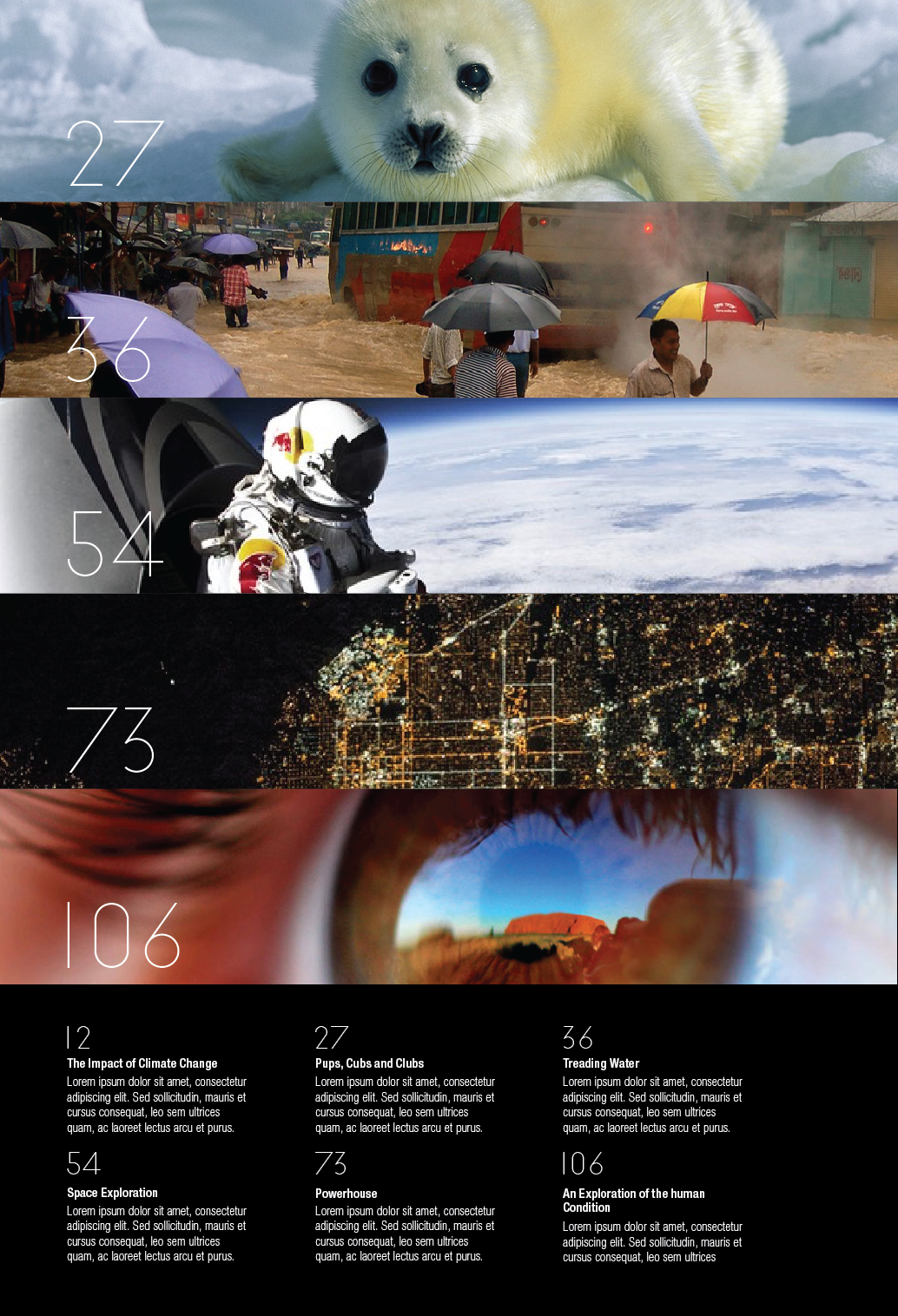
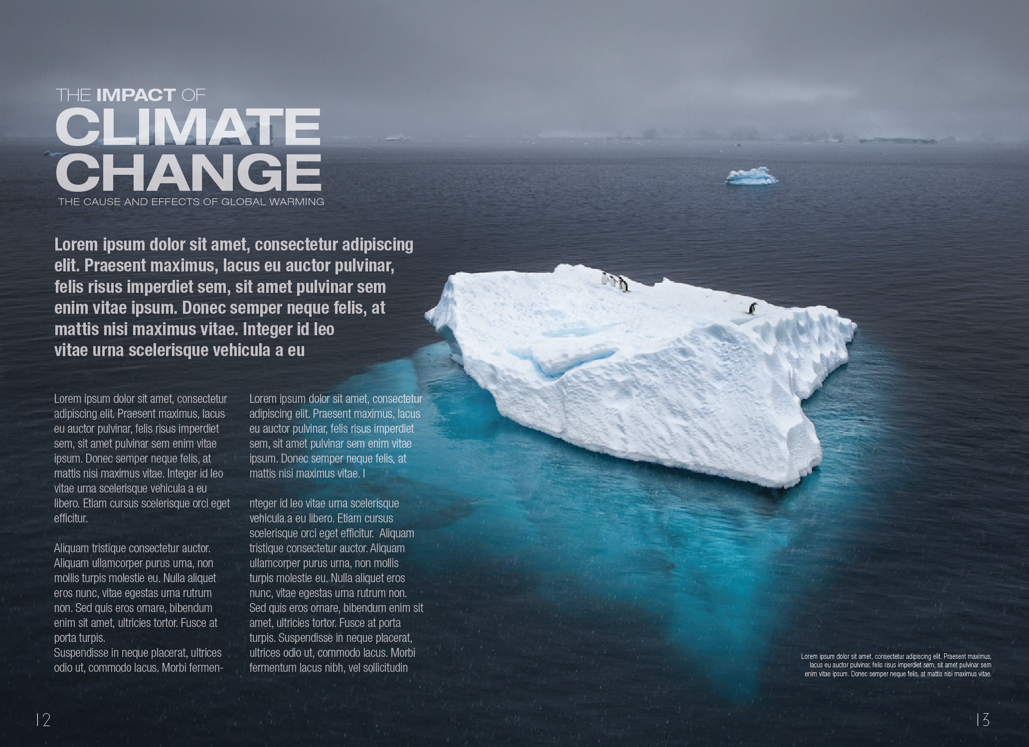
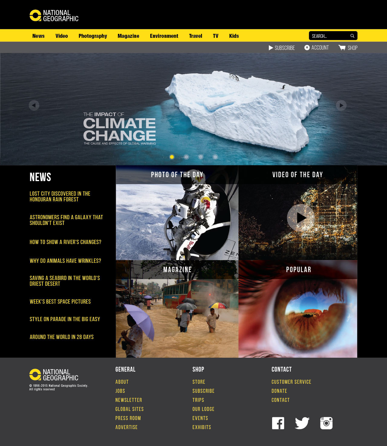
For the logo, I combined the focus lens of a camera with the pinpoint on a map, giving a sense of redirection downward towards the main article of the magazine. For the magazine, I wanted to combine the photos with the content itself to give it a symbiotic relationship. Lastly for the website, the photography would remain more important through the use of a carousel and the four additional links to their other content.
Programs: Adobe Illustrator


