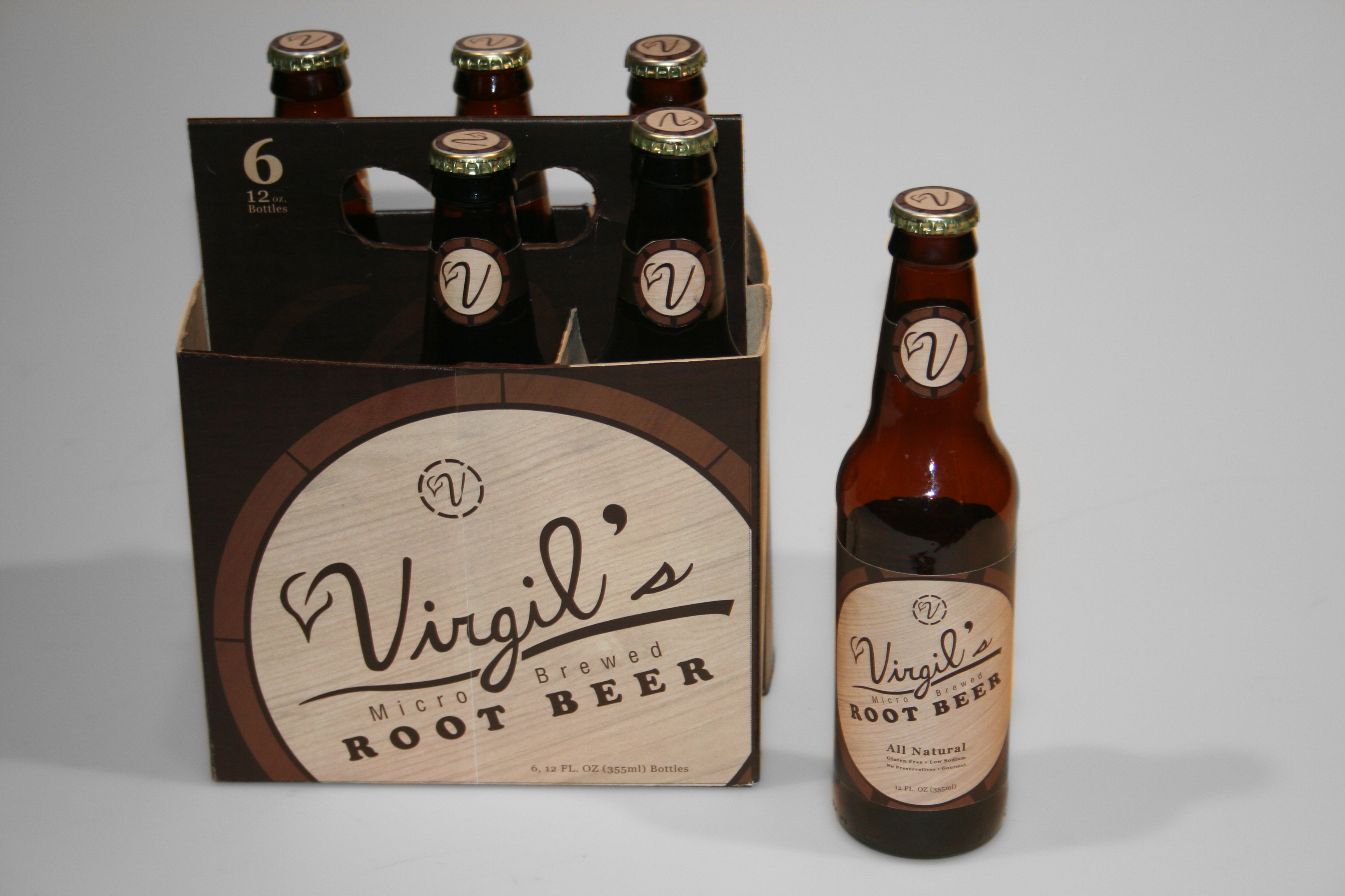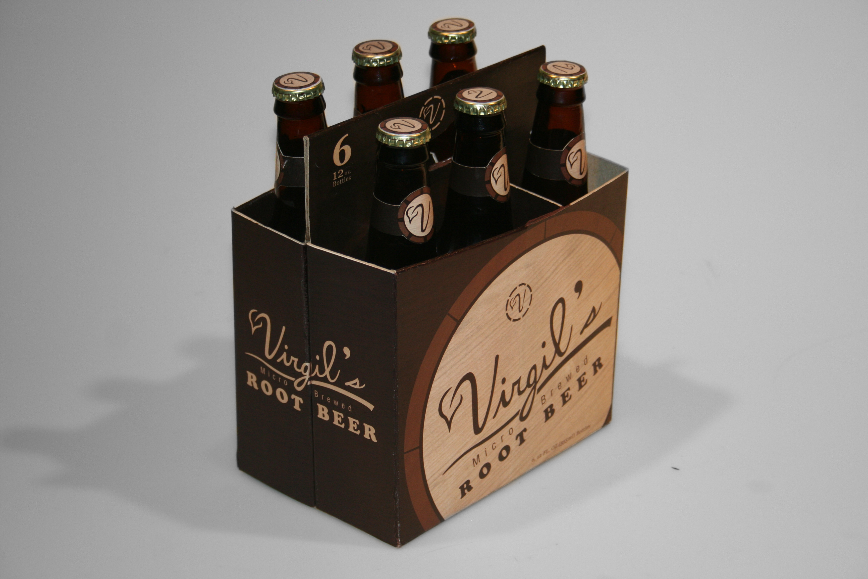
Virgil's Root Beer Rebrand Concept
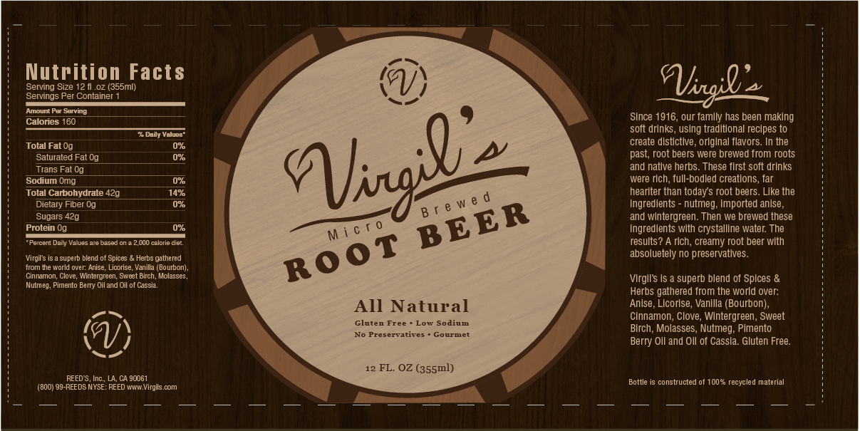
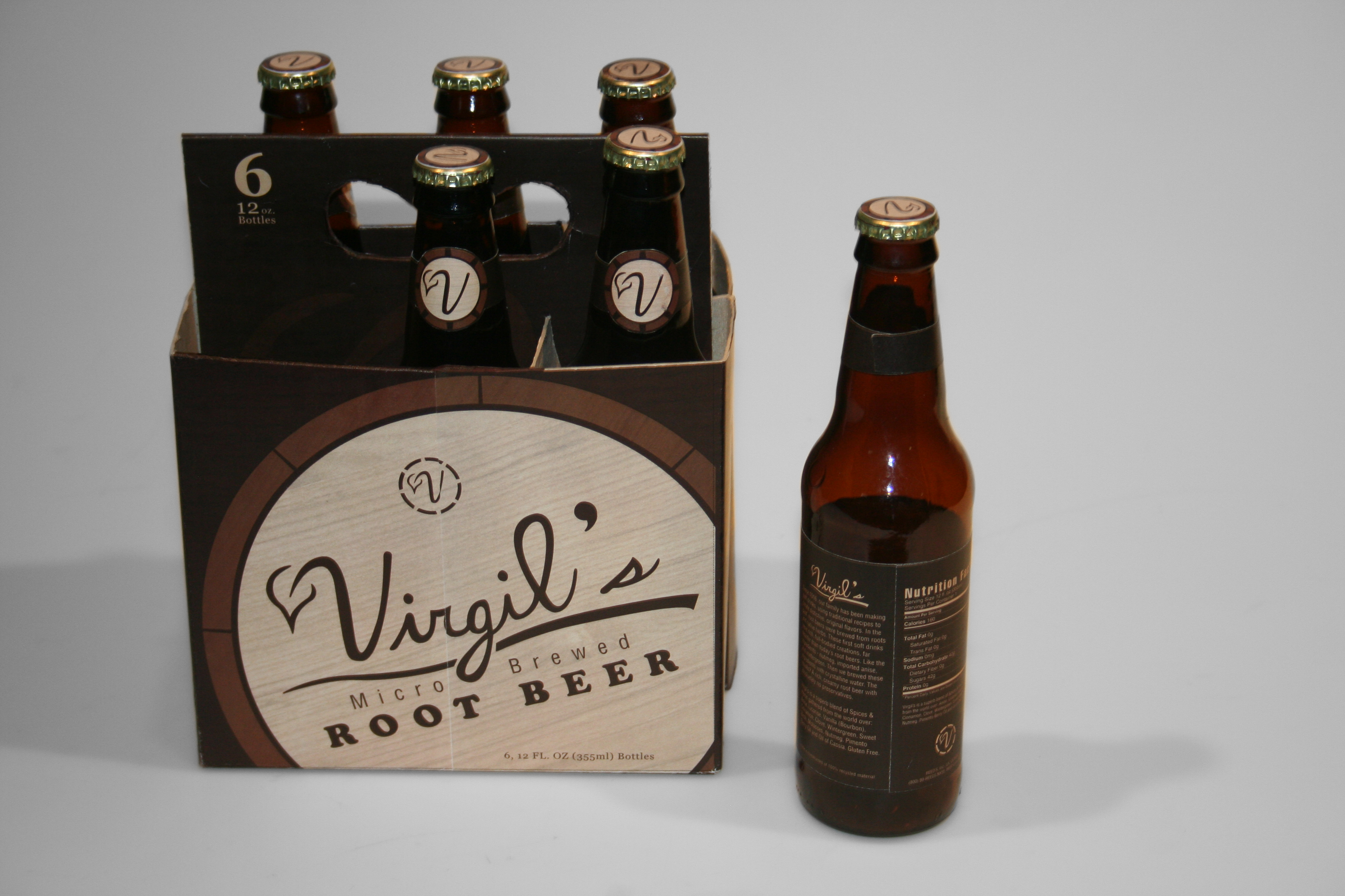
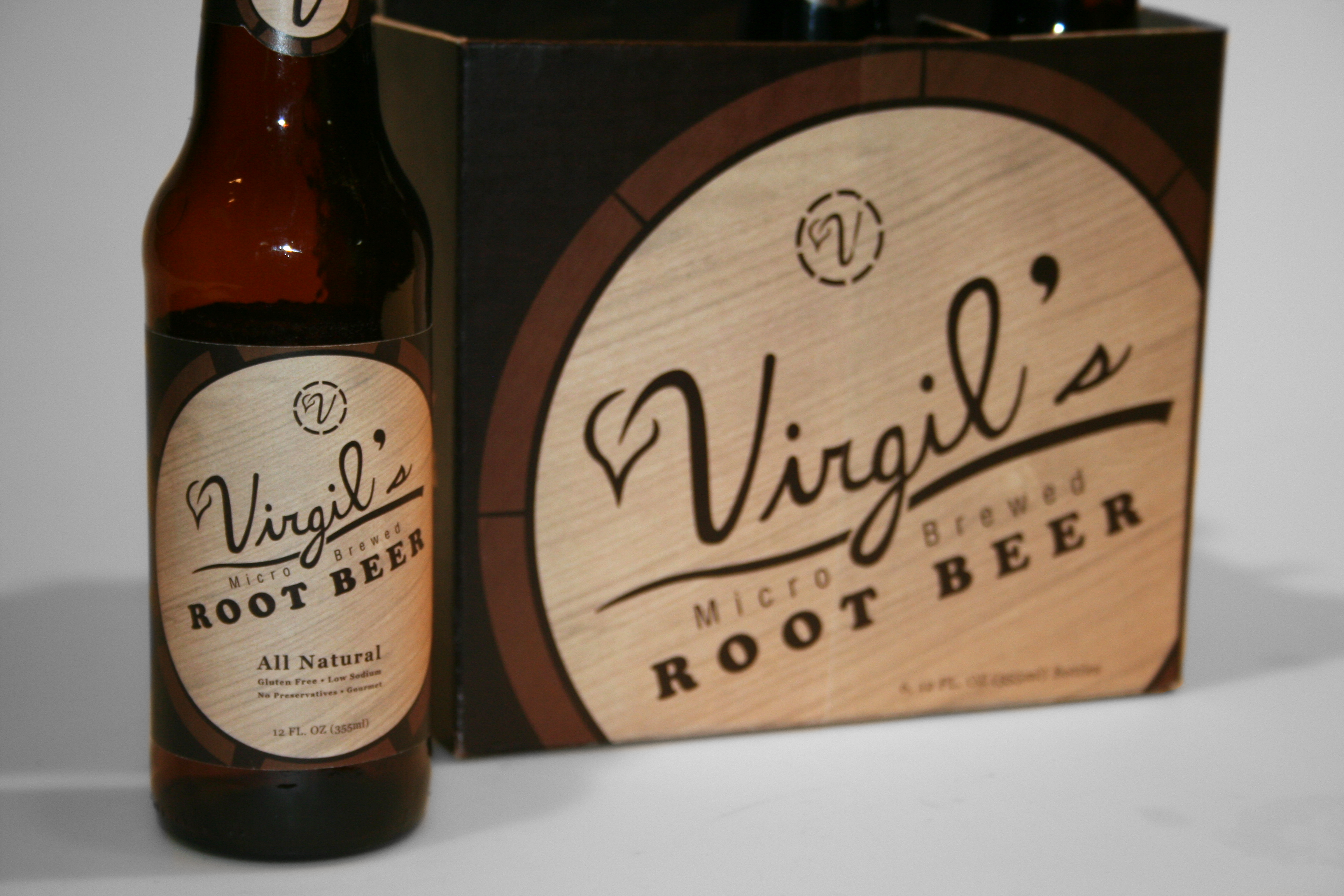
For this student packaging design project, the assignment was to rebrand and redesign a four or six pack beverage of our choosing. The task included redesigning the logo, printing the labels and creating a package able to hold up a full set of bottles.
I chose Virgil's Root Beer because of it's poor attempt at communicating gourmet, micro brewed, organic and vintage in its design. I wanted to focus more on the idea of a gourmet, hand-crafted design in order to appeal to it's niche audience of root beer lovers.
