Gekkeikan Sake Bottle Redesign
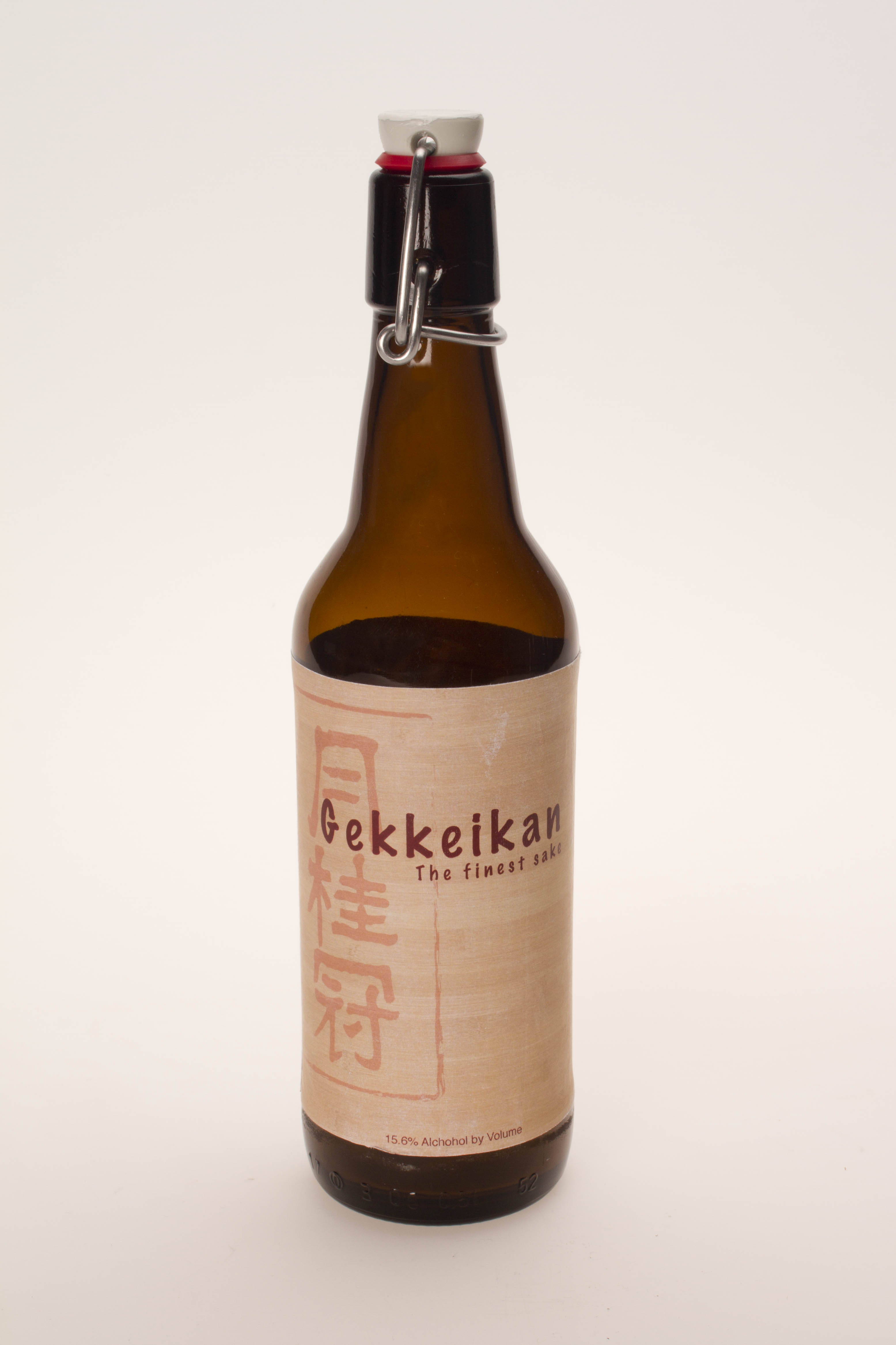
For this student project, the assignment was to rebrand the Gekkeikan sake bottle to an American audience.
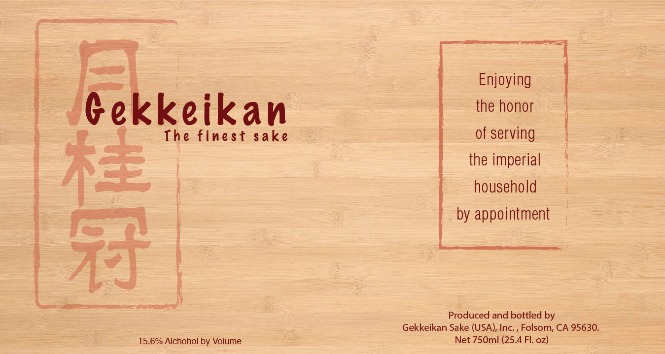
Focusing on the idea of a woodblock print, I wanted to reinforce its eastern origins as an old and special sake. The muted color scheme and wood background were intended to give it a natural look that complimented the kanji logo. The font used for the english text was also meant to give it a hand written and crafted feel.
Programs: Adobe Illustrator

