Rebecca Randall Bryan Gallery Posters
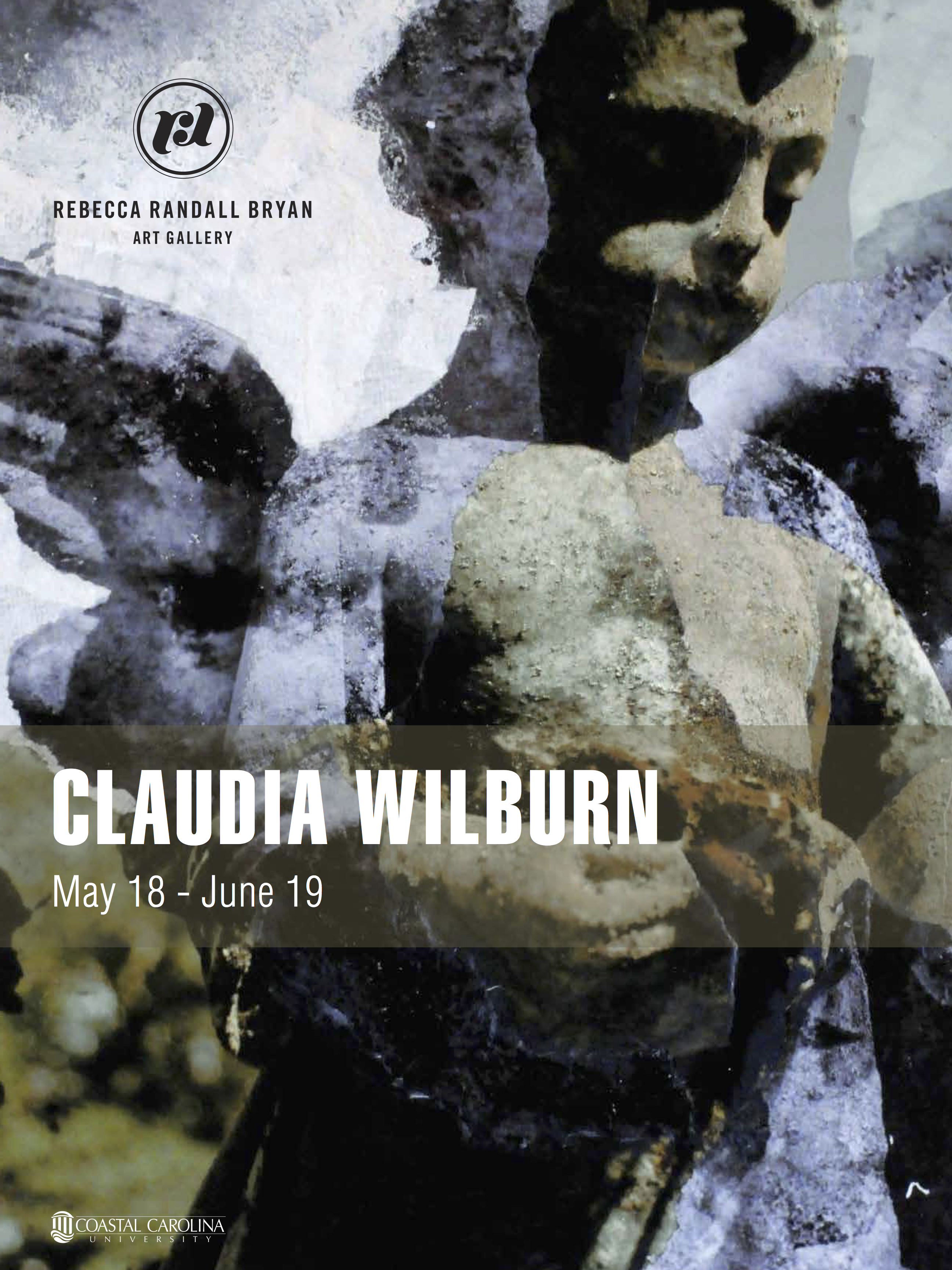
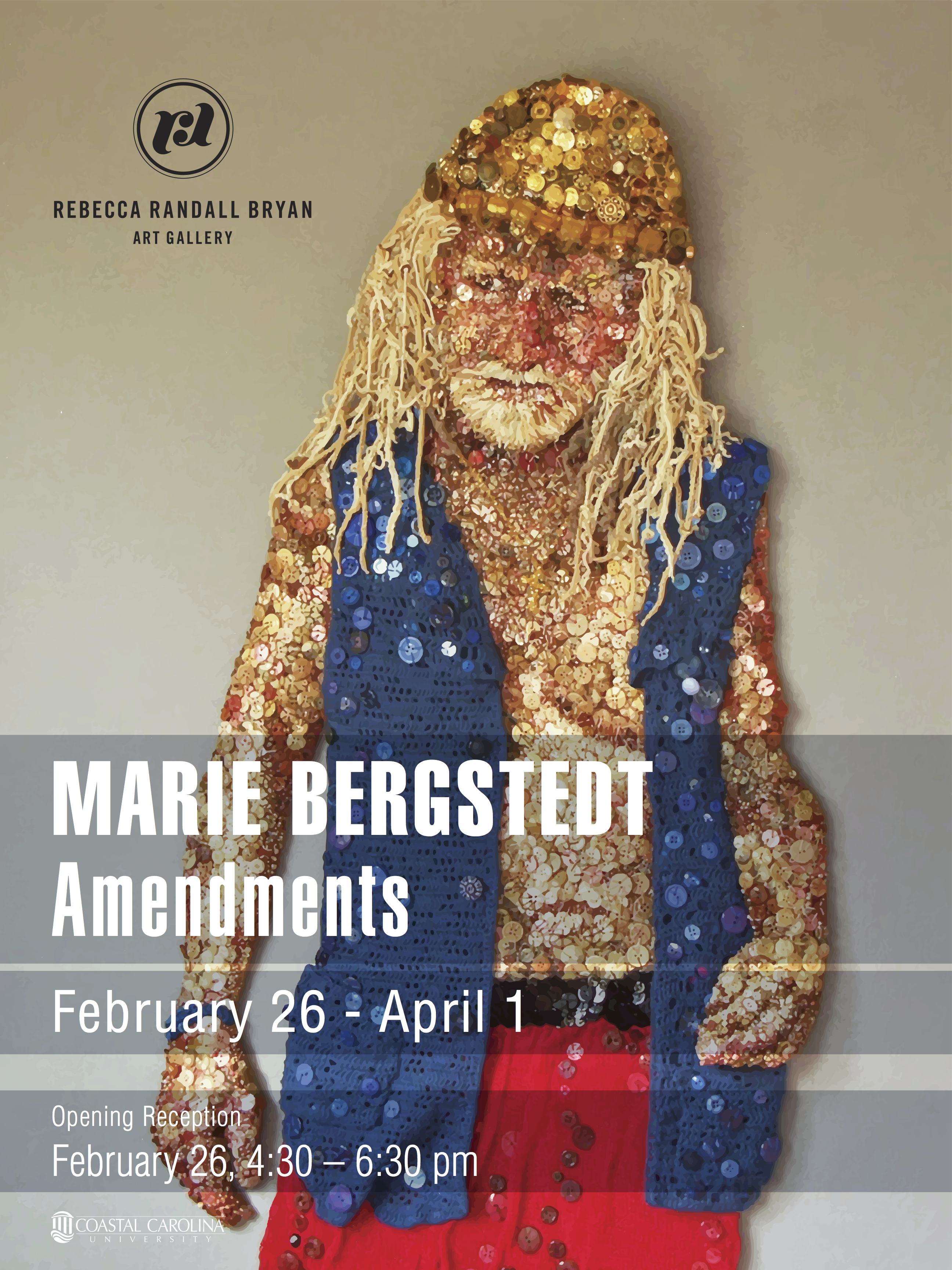
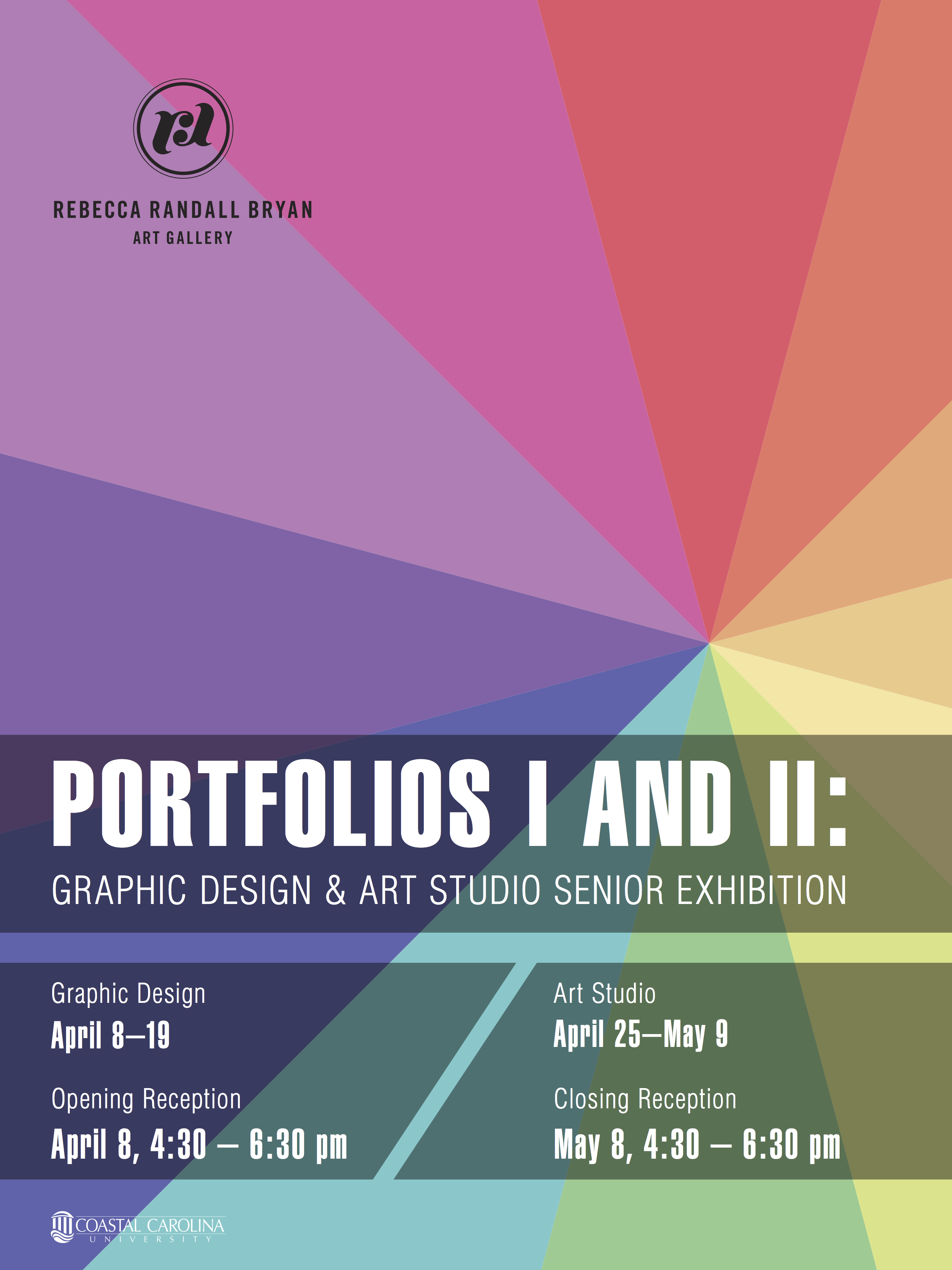
For these gallery posters, I was tasked with these for the upcoming exhibitions at the time.
In order to make sure the images were front and center, I chose to create transparent blocks so the text remained legible and did not completely interfere with the works themselves. The idea for the senior show poster was to create a color palette in the feel of spring and become purely a focal point of interest, merging different backgrounds into one location.
Programs: Adobe Illustrator


