Seattle's Best Coffee Redesign Concept
For this student packaging project, the assignment was to rebrand one of a set of coffee companies to match a preset redirection of the company's overall goal.
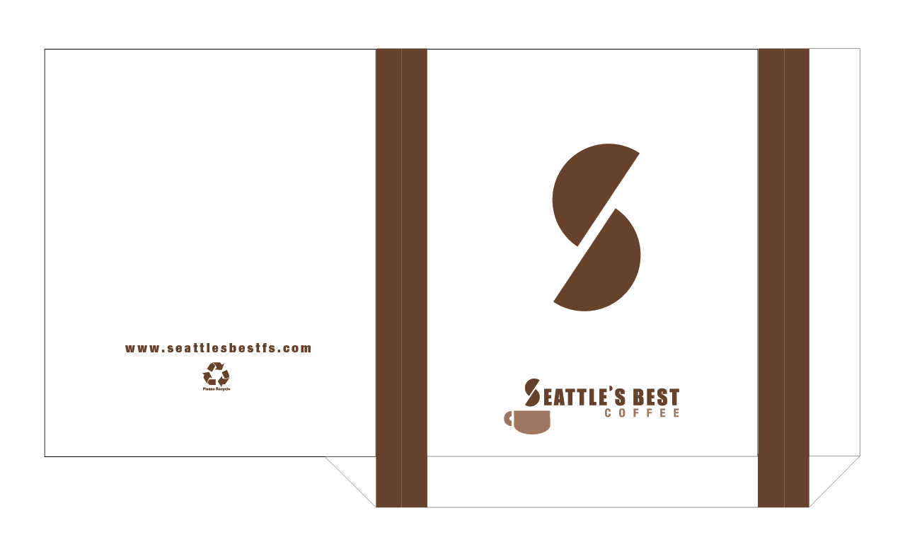
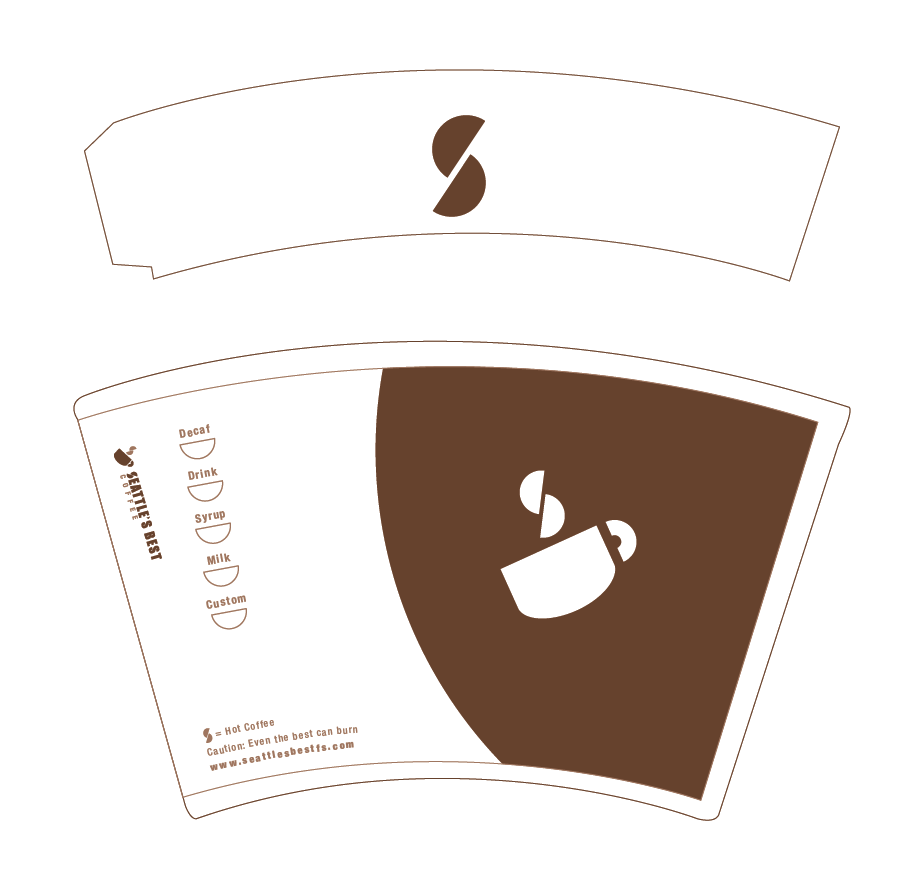
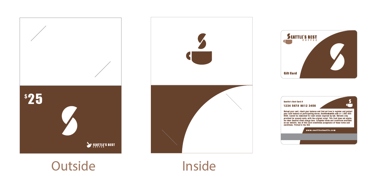
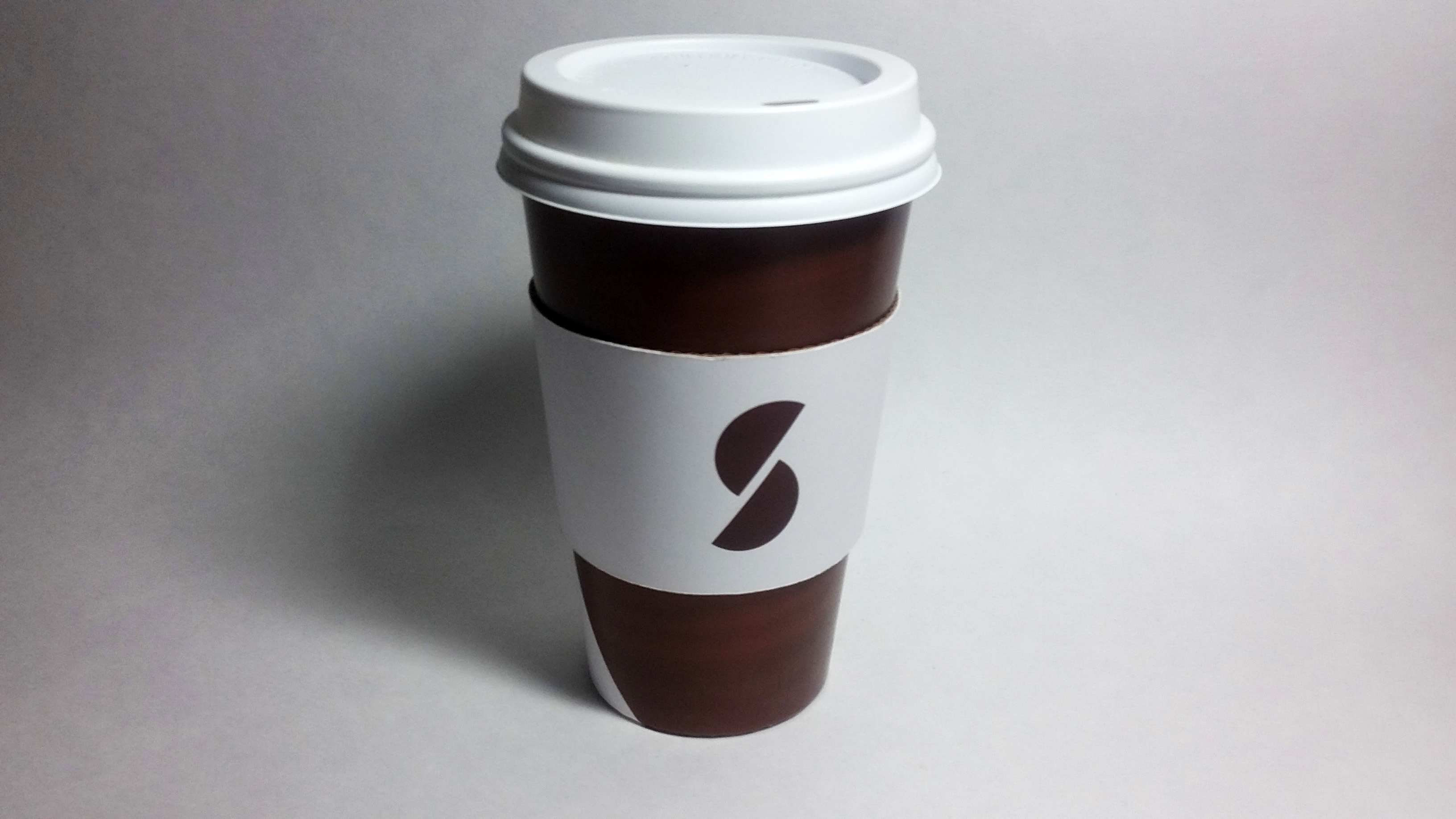
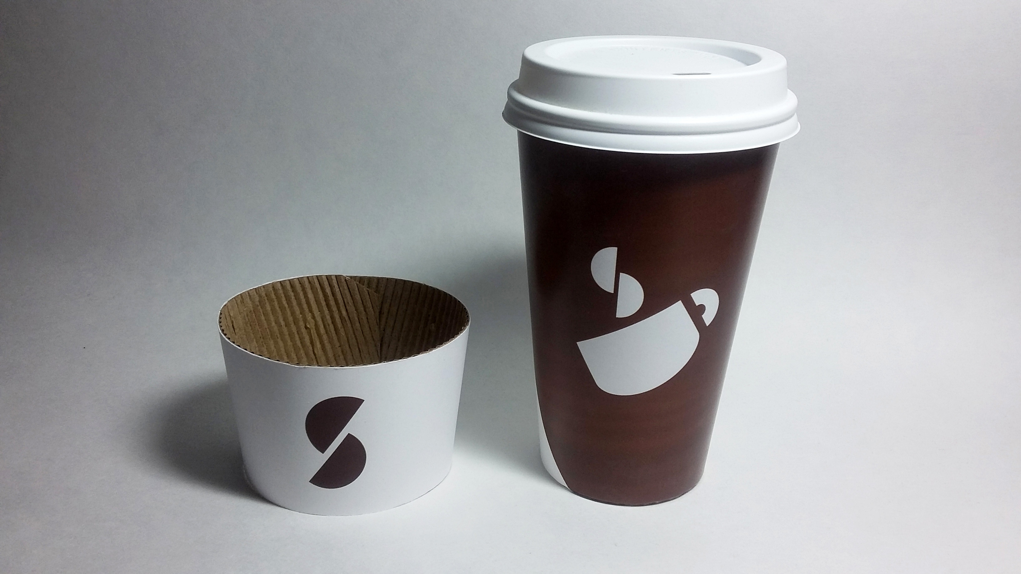
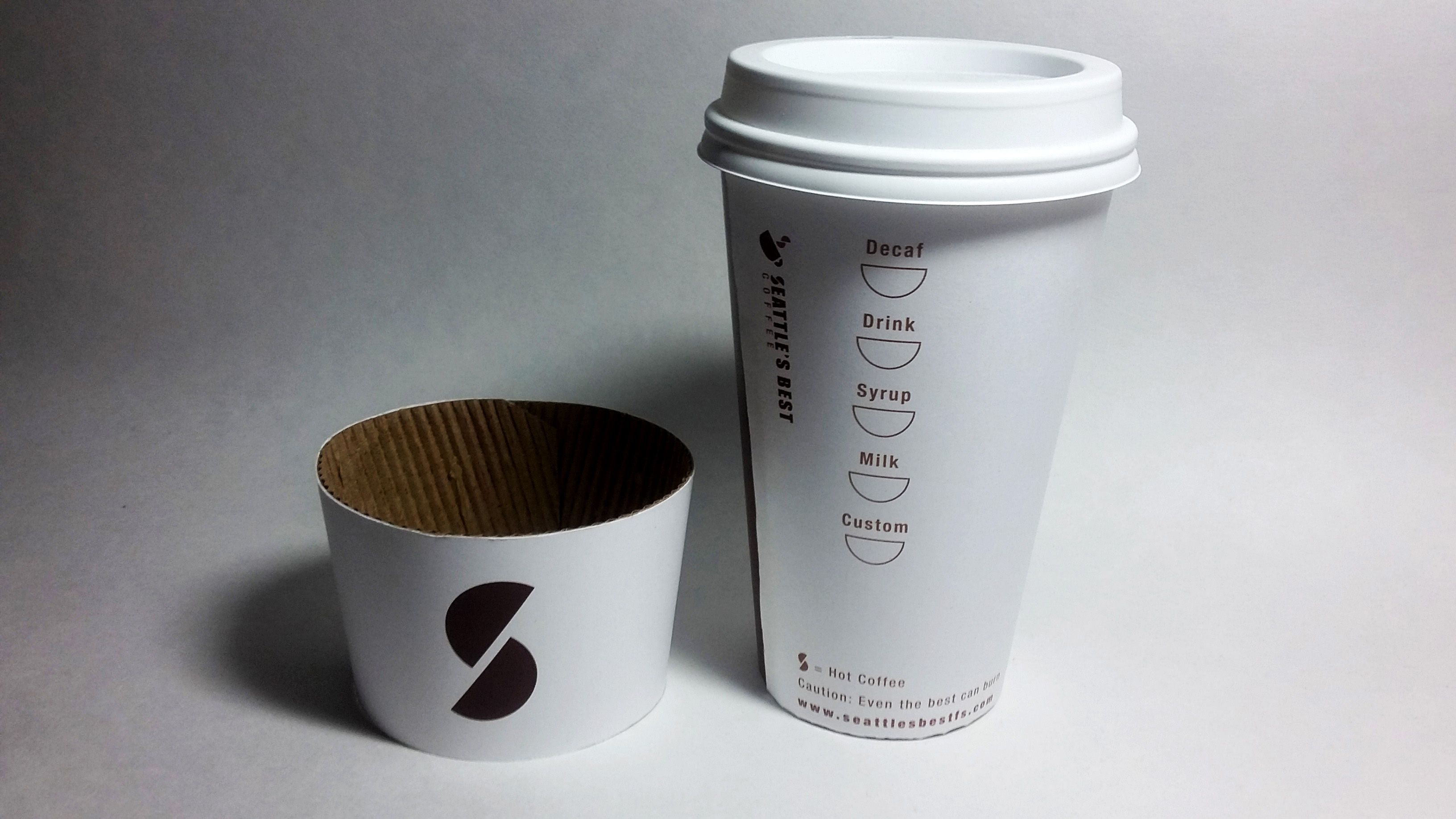
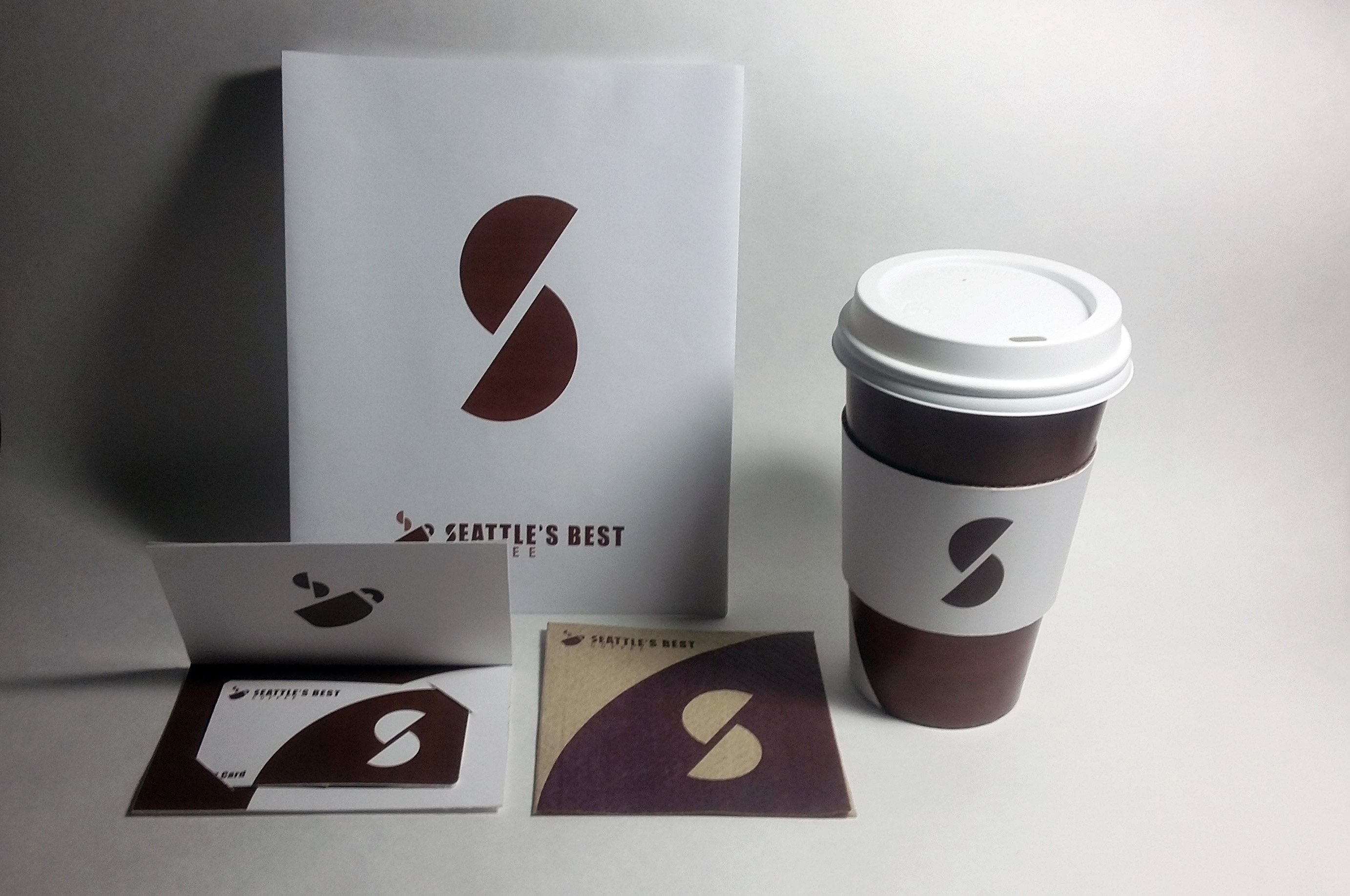
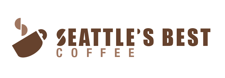
I chose Seattle's Best Coffee and it's redirection towards blue collar workers. I wanted to focus on an approachable logo that gave the impression of a bold, strong coffee. I followed this through with the rest of the design by focusing on the solid, contrasting colors and universal mark.
Programs: Adobe Illustrator