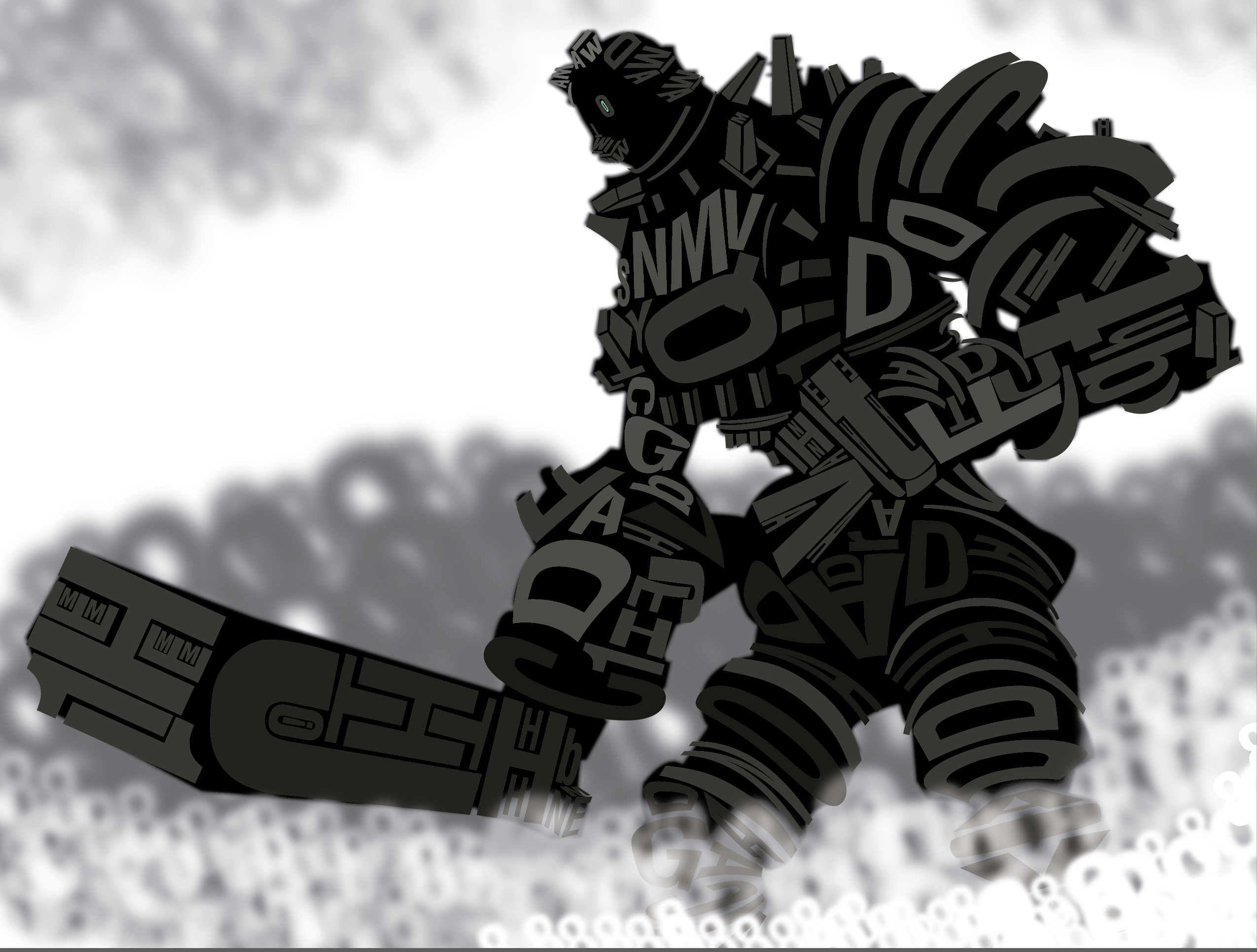
Shadow of the Colossus Typography
For this student illustration project, the assignment was to create a typography poster out of a character or our choosing.
I chose the third colossus from Shadow of the Colossus because of both its geometric and organic shapes. I felt that it would be appropriate to keep a black silhouette to keep its strong sense of size and scale while also contrasting with the foggy white zeros. Despite the fact that creating typography characters was a new thing for me, I found it be quite entertaining bending and reshaping text to fit in place.
