Zaxby's Branding Redesign Guide
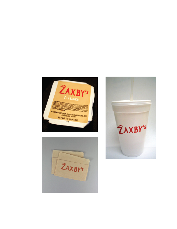
For this student graphic design project, the assignment was to redesign a logo and create a branding guide from one of a set of companies.
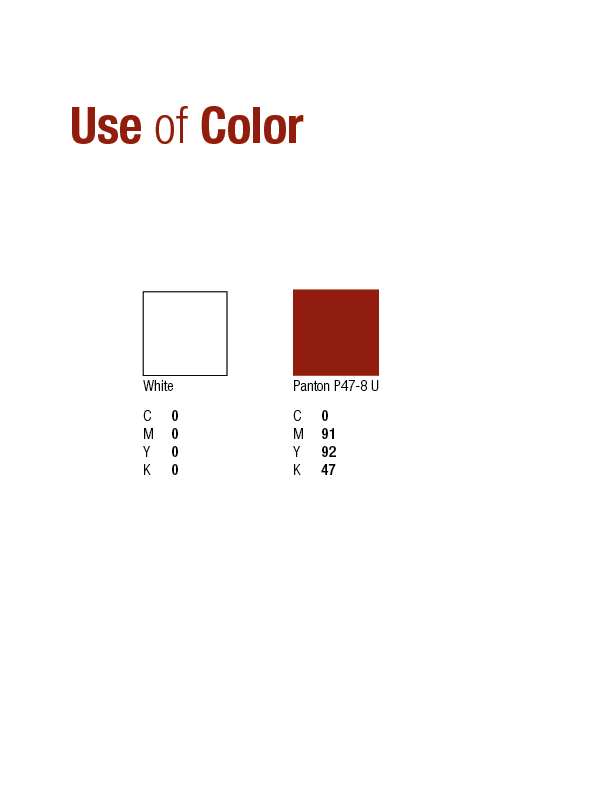
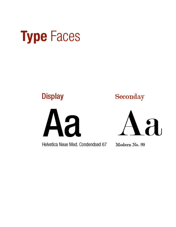
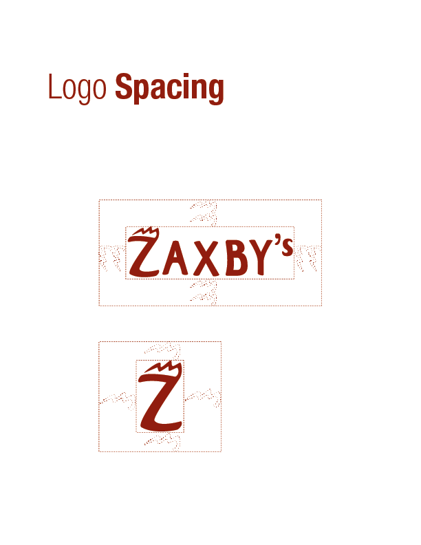
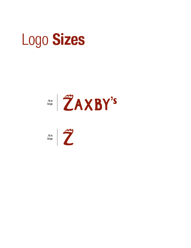
Because of its conflicting design choices, I decided to pick Zaxby's logo. I wanted to reduce the amount of colors and focus more on a solid design with the Z as brand's universal mark. The idea was to create a stronger sense of family friendly fun through the use of bold and curved letters.
Programs: Adobe Illustrator / Adobe Indesign
