Zaxby's Website Redesign Concept
For this student web design project, the assignment was to redesign one of a set of poorly made websites.
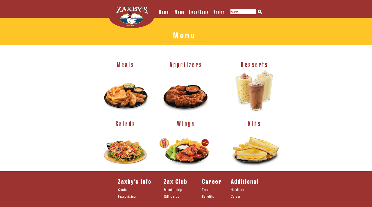
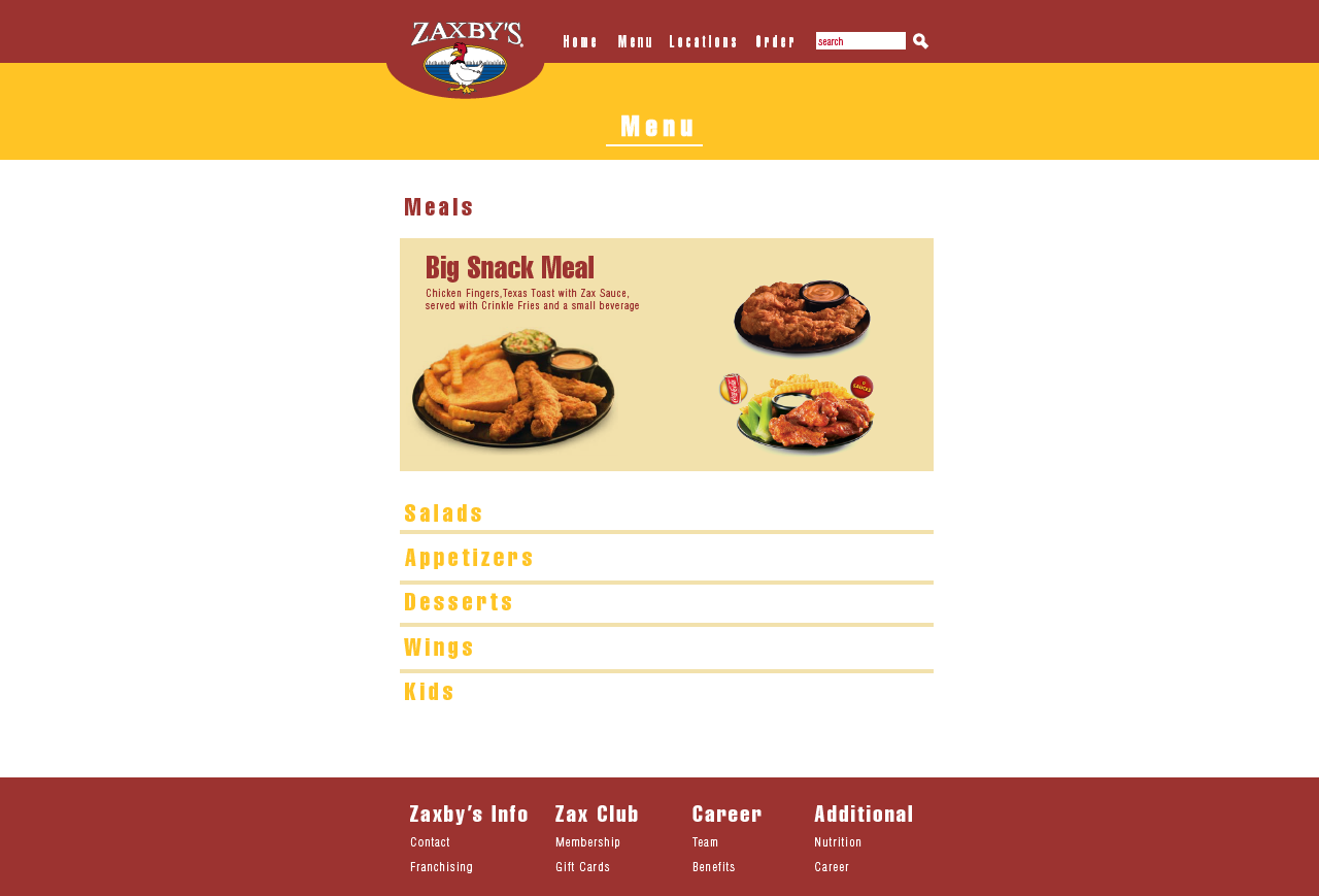
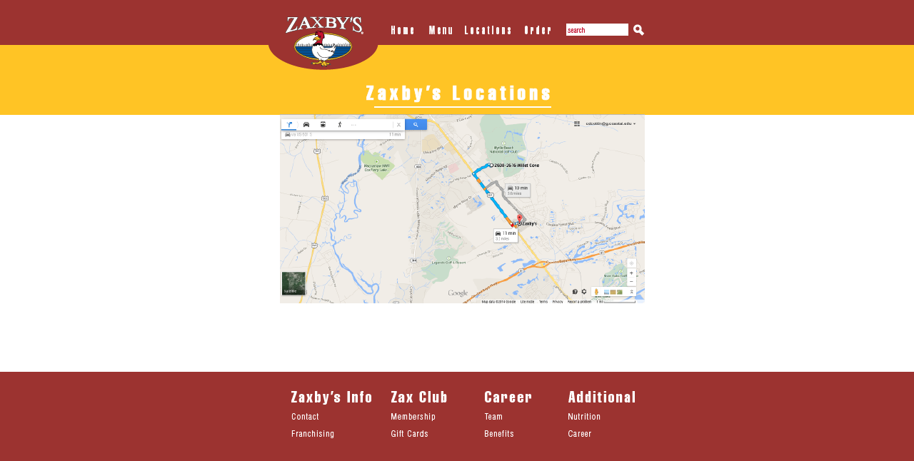
I had chosen to redesign Zaxby's website as it failed to meet modern standards at the time. Instead of utilizing their blue and red color scheme, I went with more traditional colors of red and yellow with white. The focus was geared towards wide, stretching rows and giving the advertisements a front and center space with the carousel.
Programs: Adobe Illustrator / Adobe Dreamweaver


